Showing posts with label Lyle Wheeler. Show all posts

Best Art Direction, 1946

Awards presented March 13, 1947

Like the cinematographers, the art directors decided to sharply reduce the number of nominees this year -- in their case, to three per category. 


The nominees were ... 
(Black-and-White) 
(Color) 
... when they should have been ... 
(Black-and-White) 
(Color) 
And the Oscar went to ... 
(Black-and-White) 

The lavish decor for the movie sometimes resembles that of a very expensive Thai restaurant. Director John Cromwell had hoped for color, but the studio wouldn't spring for it. Art director Lyle Wheeler got his chance to do it over in color ten years later when it became The King and I, reusing many of the original designs. He won an Oscar for that version, too.  

(Color) 
The Yearling. Art Direction: Cedric Gibbons, Paul Groesse; Interior Decoration: Edwin B. Willis. 

Something of a surprise winner in this category, given that much of the film takes place out of doors and the interiors are the sparsely furnished cabins of impoverished Florida farmers. 

... when it should have gone to ... 
(Black-and-White) 
Alexandre Traunder

Léon Barsacq
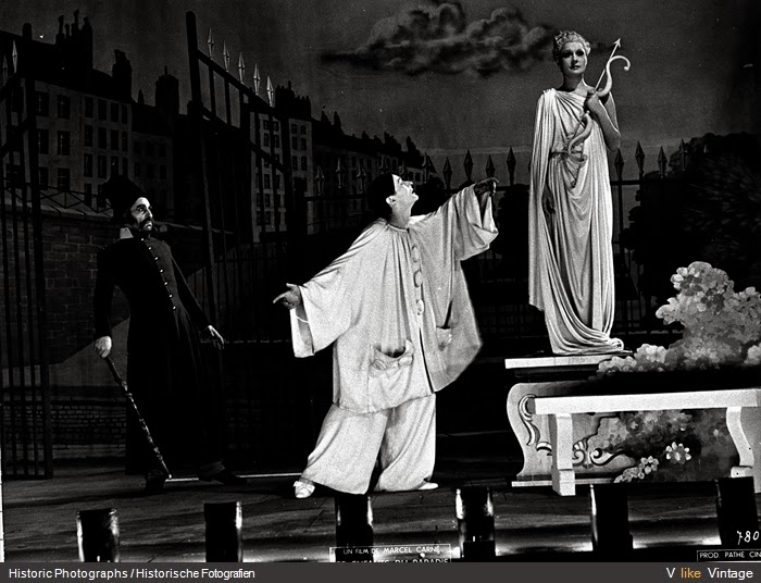
Marcel Carné's brilliant re-creation of the nineteenth-century French theater scene was made under the harshest of conditions under Nazi occupation, including the fact that art director Alexandre Trauner was Jewish, and was forced to hide that fact from the Vichy authorities. Some of the exterior sets had to be completely rebuilt after being damaged by a storm, and throughout the filming materials were in short supply. So the fact that the film was made at all is remarkable enough. That it is truly beautiful as well is miraculous. Barsacq would later be nominated for his work on The Longest Day. Trauner would have a regular working relationship with Billy Wilder and win an Oscar for The Apartment, as well as being nominated for his work with John Huston on The Man Who Would Be King.
Baptiste (Jean-Louis Barrault) gives Garance (Arletty) a role in his latest pantomime 


(Color) 
Henry V. Art Direction: Paul Sheriff, Carmen Dillon.

Carmen Dillon
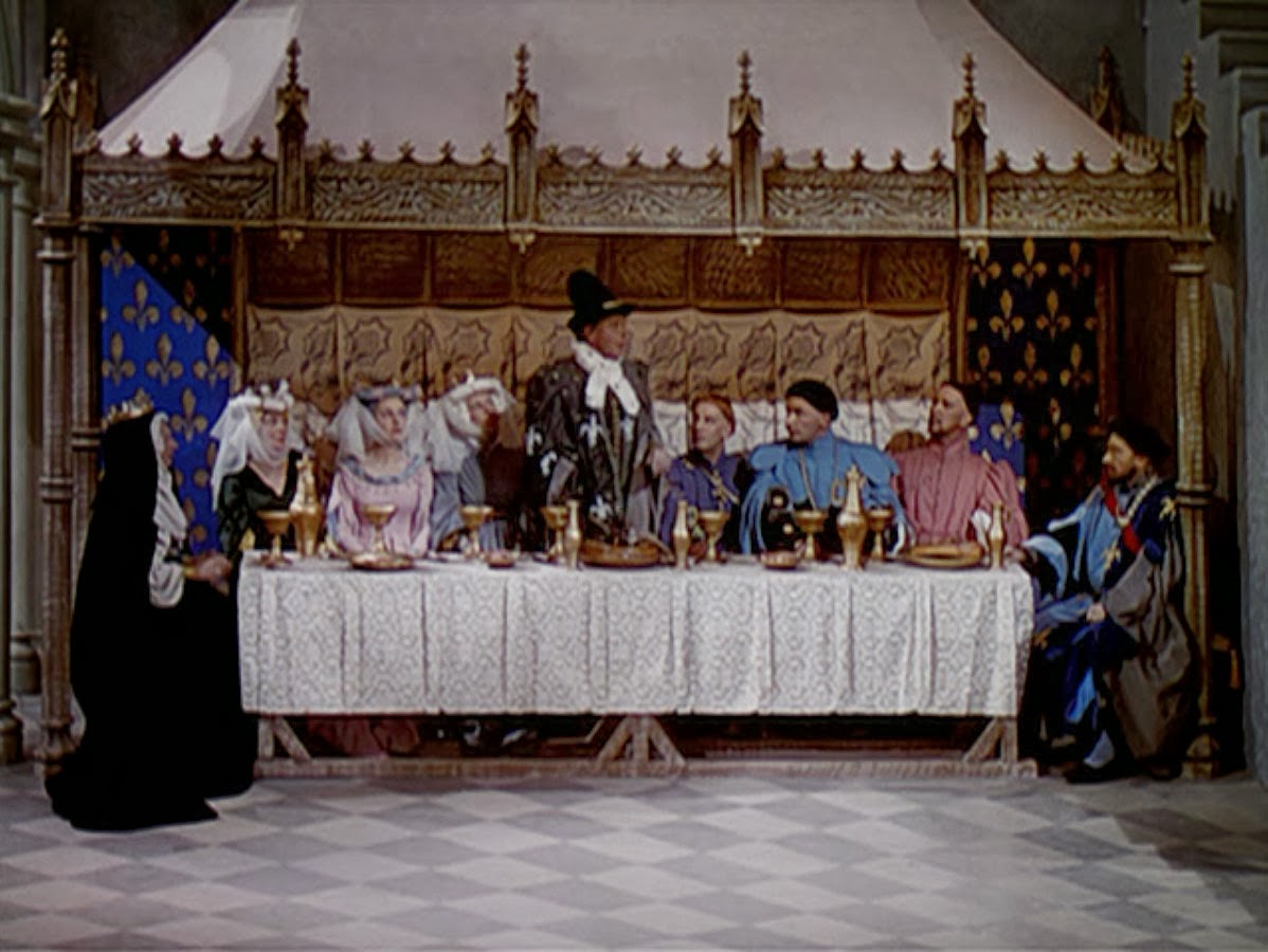
This fine version of Shakespeare's play was originally planned as a wartime morale booster, and it shows director and star Laurence Olivier at his creative best, well-supported by Leo Genn, Felix Aylmer, Robert Newton, Max Adrian, Robert Helpmann, Ernest Thesiger, and Renee Asherson, among many others. But it's also a tribute to the creative work of Paul Sheriff, the Russian-born designer who was the mainstay of many of the British-made films of the 1940s and '50s, and Carmen Dillon, who won an Oscar for Olivier's Hamlet. She also trained many of the British designers who would follow her in the 1960s and '70s, including Oscar winners John Box, Terence Marsh, and Roy Walker. The design of Henry V is something of a tour de force, as the film begins in a re-creation of the Elizabethan Globe theater, then moves into a stylized presentation, and finally into realistic battle scenes. Some of the sets are modeled on the images from the French gothic illuminated manuscript, the Très Riches Heures du Duc de Berry, which was contemporary with the actual King Henry V. 
From the Très Riches Heures du Duc de Berry
Banquet scene in Henry V 
The Chorus (Leslie Banks) on the stage of the Globe in Henry V
A view from the Globe stage in Henry V 
The stylized gates of Harfleur in Henry V
Laurence Olivier as Henry V 


Best Art Direction, 1945

Awards presented March 7, 1946
The nominees were ... 
(Black-and-White)
(Color) 
... when they should have been ... 
(Black-and-White) 
And the Oscar went to ... 
(Black-and-White) 
Blood on the Sun. Art Direction: Wiard Ihnen; Interior Decoration: A. Roland Fields. 

James Cagney plays a newspaper editor and Sylvia Sidney a Eurasian counterintelligence agent in pre-World War II Japan. Thick with propaganda, the movie still manages to be fairly entertaining today. Ihnen picked up his second Oscar in a row for the film, which was produced by Cagney and his brother William for their independent production company. This was the only Oscar win for Fields, who was nominated for his work on Citizen Kane and The Magnificent Ambersons, and should have won for both. 

(Color) 
Frenchman's Creek. Art Direction: Hans Dreier, Ernst Fegte; Interior Decoration: Sam Comer. 

Beautiful but empty-headed Restoration bodice-ripper in which Joan Fontaine enters into a loveless marriage to Ralph Forbes to escape the designs of his rakish friend Basil Rathbone. She escapes to her family home in Cornwall, where she meets handsome pirate Arturo de Cordova. This was the first Oscar win for Dreier, the head of the Paramount art department. He had been nominated eighteen times previously, and would be nominated three more times and win twice. This was the only win out of four nominations for Fegte. This was the first of four wins for Comer, Paramount's head set decorator. He was nominated twenty-six times. 

... when it should have gone to ... 
(Black-and-White) 
The Lost Weekend. Art Direction: Hans Dreier, Earl Hedrick; Interior Decoration: Bertram Granger. 

Hans Dreier
Dreier got his Oscar this year for an opulent romantic drama, but he should have got it for leading his team of designers and decorators in creating one of the starkest and grittiest of Oscar-winning films. Among other things, the designers rebuilt the interior of the New York bar P.J. Clarke's on a soundstage, and the tale is often told that Robert Benchley, homesick for New York, would stop in on the set every afternoon at five, when actor Howard Da Silva, playing the bartender, would pour Benchley a shot. Neither Hedrick nor Granger ever won an Oscar, but this would have been an excellent opportunity for a win, if the Academy had seen fit to nominate them.

Howard Da Silva and Ray Milland in the soundstage P.J. Clarke's
Da Silva behind the bar
Location filming in New York still necessitated set dressing
Milland's Don Birnam has trashed his apartment in search of a bottle he has hidden away
One of Birnam's secret bottles
(Color) 
Leave Her to Heaven. Art Direction: Lyle Wheeler, Maurice Ransford; Interior Decoration: Thomas Little.

In commenting on the art direction of Leave Her to Heaven, I have only to refer to my comments on Leon Shamroy's Oscar for the film: This is a stunning and essential example of what can happen when cinematographers and designers work together. Any objection that the movie would have been better in black-and-white vanishes when you look closely at the work Wheeler, Ransford, and Little put into achieving a cohesive palette, rich yet muted, relying on purples and grays. Having seen what an intelligent use of color can do in Leave Her to Heaven makes me amazed that the Academy should have preferred the candy-box colors of  Frenchman's Creek. Wheeler and Little, as heads of their departments, raked in Oscars and nominations; Ransford was nominated three times but never won. 

Gene Tierney dozes, the redness of her lipstick providing the only jolt of primary color 
The white gown is ironic, the chess game prophetic
Mirror, mirror on the wall
Tierney and Cornel Wilde encounter in a luxurious train car
Predator and prey? Note the Production Code-mandated twin beds. 
Wilde on studio rocks before a painted drop. Noticeable in a still, less so in a theater.
Early American decor, maybe a bit too Laura Ashley, but the quilted dressing gown with its military frogs is a nice touch.
Vincent Price questions Wilde on the witness stand. Note the simplicity of the courtroom, with the circular window suggesting either a halo or the eye of God. 

Best Art Direction,1940

Awards presented February 27, 1941

If there were going to be separate awards for both color and black-and-white cinematography, the art directors argued, then there should be for art direction, too. And rightly so. If you've ever seen some of the attempts to "colorize" black-and-white films undertaken in the 1980s, you can tell how a production designer needs to keep different things in mind depending on whether the film is in color or not. I recall watching the colorized version of Casablanca and being startled by the paisley blouse Ingrid Bergman wears in one scene. It's completely suitable in black-and-white, but in the color version it looked as if Bergman was being eaten alive by giant paramecia. That's why, when the costumers finally got their Oscar a decade later, the division between black-and-white and color applied to them, too.

The nominees were ... 

(Black-and-White) 

(Color) 
And the Oscar went to ... 
(Black-and-White) 

Janeites have always been appalled by the costuming (Adrian's) and decor (Edwin B. Willis is the credited set decorator) of this version of Pride and Prejudice. It has been moved up in time so that the women can be dressed in Victorian hoops and crinolines instead of Regency styles. The result, as Pauline Kael observed, is "more Dickens than Austen." But at least that's translating one kind of greatness into another. This was the first of three Oscars for Groesse, who also won for The Yearling and Little Women and was nominated eight more times. 

(Color) 

Vincent Korda


The youngest of the three Hungarian Korda brothers who took the British film industry by storm in the 1930s, Vincent came to Britain with Alexander and Zoltan after studying at the Budapest Academy of Art. In addition to his Oscar-winning work on The Thief of Bagdad, he received nominations for That Hamilton Woman, the 1942 Jungle Book, and The Longest Day. His work on creating the haunted atmosphere of postwar Vienna for The Third Man, however, went curiously unnominated. The extent of his design work on The Thief of Bagdad is no doubt considerable, but some of the credit also should be shared with others including William Cameron Menzies and the matte artist Peter Ellenshaw. Together, they made the film one of the greatest of motion picture fantasies.


... when it should have gone to ... 
(Black-and-White) 

This would have been two in a row for Wheeler, after his win for Gone With the Wind, but for some reason he was passed over in favor of the rather twee designs of the MGM Pride and Prejudice. Certainly a great deal of the credit for the success of Rebecca should go to Wheeler's designs for Manderley, the DeWinter estate haunted by Rebecca and her sinister acolyte Mrs. Danvers.


Best Art Direction, 1939

Awards presented February 29, 1940

The nominees were ...

And the Oscar went to ... 

This was the first of five Oscar wins for Wheeler, who also was nominated twenty-four times, a record exceeded only by MGM's Cedric Gibbons and Edwin Willis. Trained as an architect at the University of Southern California, he had worked as Gibbons's assistant art director before being hired by David O. Selznick in 1936. Wheeler's work on Selznick's film The Garden of Allah, which was shot in Technicolor, prepared him for the use of color in Gone With the Wind. The actual design of GWTW was done by William Cameron Menzies, but technicalities in the Academy's nominating rules prevented Menzies from being nominated for art direction. (The Academy compensated by granting Menzies a special award for his work on the film. A similar courtesy might well have been extended to Walter Plunkett, the costume designer.) But it was Wheeler's architectural background that helped bring Menzies's ideas to fulfillment. In 1944, Wheeler became the chief art director at 20th Century-Fox. 

Wheeler, left, looks at pre-production sketches, many of them by William Cameron Menzies, with producer David O. Selznick
The Twelve Oaks library in sketch form ...
... and as realized on film
Tara, larger and more opulent than a real plantation house would have been, and with the curiously off-set entrance
Tara after filming
The film's design contrasts an ante-bellum grace ... 
... with the Victorian excess of Scarlett's boudoir after the war
There was no costume design category in 1939 for Walter Plunkett to win.